
Astra Theme Dark Mode UI: Custom CSS Snippet for a Glassmorphism Toggle
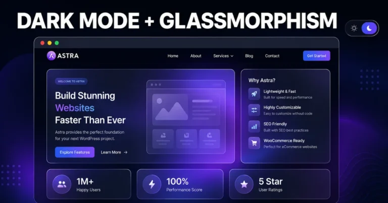
Dark mode stopped being a “nice-to-have” a while back. In 2026, visitors expect it — especially on content-heavy sites, dashboards, and portfolios where people are reading for more than a few seconds at a time. If you’re running WordPress on the Astra theme, you’ve probably noticed Astra now ships a built-in Color Switcher for basic light/dark toggling. It works, but it’s fairly plain — a straightforward color swap with no real personality.
If you want something that actually looks like a 2026 product rather than an inverted color scheme, that’s where custom CSS comes in. In this guide, we’ll build a dark mode toggle for Astra using a lightweight CSS + JavaScript snippet, styled with a glassmorphism effect — that frosted, semi-transparent panel look you’ve seen on Apple’s marketing pages and countless SaaS dashboards. No premium dark mode plugin required.
This is the same approach our team at Dynamic Tech World uses when a client wants dark mode that actually matches their brand instead of a generic inverted palette.
Table of Contents
Why Build This With Custom CSS Instead of a Plugin
Astra’s native Color Switcher and third-party plugins both work by remapping Astra’s global color variables or applying broad color inversion across the page. That’s fine for a quick toggle, but it comes with two limitations:
- You’re stuck with whatever visual style the plugin gives you — flat color swaps, no depth, no texture
- Plugins add extra PHP and JS overhead, which matters if you’re chasing Core Web Vitals scores for a Tier-1 client site
A hand-written CSS snippet gives you full control over exactly how dark mode looks — including glassmorphism effects, smooth transitions, and a toggle button styled to match your brand — while adding almost nothing to your page weight.
What Is Glassmorphism, and Why Pair It With Dark Mode
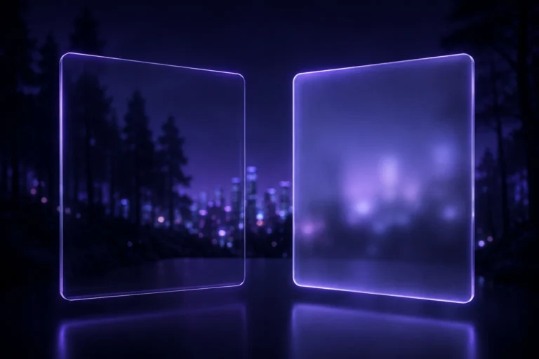
Glassmorphism is the design style built around frosted-glass panels: semi-transparent backgrounds, a soft blur behind the element, subtle borders, and light shadows that make a UI element look like it’s floating above the page. It became popular through iOS and Windows 11’s UI language and has carried into web design ever since, particularly for dark interfaces where the blur and transparency create real depth against a dark background — something that’s much harder to pull off convincingly in light mode.
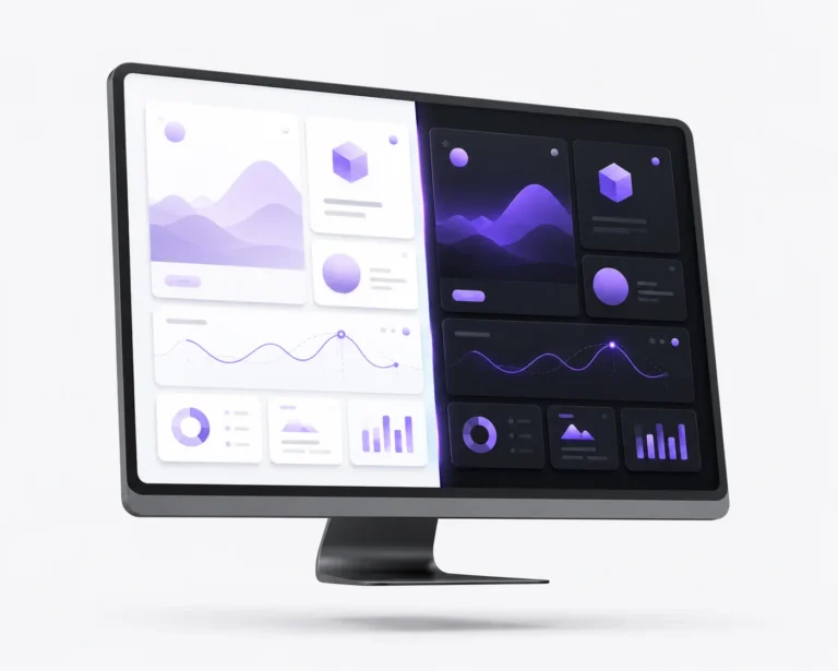
Combined with dark mode, glassmorphism gives you cards, navigation bars, and toggle buttons that feel layered instead of flat, which is exactly what separates a template-looking WordPress site from one that feels custom-built.
Step 1: Set Up CSS Custom Properties for Both Themes
The cleanest way to manage dark mode is with CSS variables defined once and swapped based on a data attribute, rather than writing separate rules for every element. Add this to your Astra child theme’s style.css, or through Appearance → Customize → Additional CSS if you’re not running a child theme:
:root {
   --bg-color: #ffffff;
   --text-color: #1a1a1a;
   --card-bg: rgba(255, 255, 255, 0.6);
   --card-border: rgba(0, 0, 0, 0.08);
   --accent-color: #6d5dfc;
 }

 [data-theme="dark"] {
   --bg-color: #0f0f14;
   --text-color: #f0f0f0;
   --card-bg: rgba(30, 30, 40, 0.45);
   --card-border: rgba(255, 255, 255, 0.12);
   --accent-color: #9c8bff;
 }

 body {
   background-color: var(--bg-color);
   color: var(--text-color);
   transition: background-color 0.35s ease, color 0.35s ease;
 }
This structure means every future style you write references a variable, not a hardcoded color — so dark mode support is automatic for anything you build afterward.
Step 2: Style the Glassmorphism Panels
This is what gives dark mode its premium feel. Apply this class to cards, the header, or any section wrapper you want to give the frosted-glass treatment:
.glass-panel {
   background: var(--card-bg);
   border: 1px solid var(--card-border);
   border-radius: 16px;
   backdrop-filter: blur(14px);
   -webkit-backdrop-filter: blur(14px);
   box-shadow: 0 8px 32px rgba(0, 0, 0, 0.15);
   padding: 24px;
 }
The backdrop-filter: blur() property is what does the heavy lifting — it blurs whatever sits behind the element rather than the element itself, which is what creates the frosted-glass illusion. This effect is genuinely more striking in dark mode, since the blur against darker background tones creates noticeably more depth than the same effect against white.
A quick compatibility note: backdrop-filter is supported in all major browsers now, but if you’re supporting very old browser versions, add a fallback background color so the panel still looks acceptable without the blur.
Step 3: Build the Toggle Button
Add this markup wherever you want the toggle to appear — typically in the header, via Astra’s Custom Menu Item or a small HTML widget in Elementor:
<button id="theme-toggle" class="glass-panel theme-toggle-btn" aria-label="Toggle dark mode">
   <span class="toggle-icon">🌙</span>
 </button>
Style the button itself:
.theme-toggle-btn {
   width: 44px;
   height: 44px;
   display: flex;
   align-items: center;
   justify-content: center;
   cursor: pointer;
   border-radius: 50%;
   transition: transform 0.25s ease;
 }

 .theme-toggle-btn:hover {
   transform: scale(1.08);
 }
Step 4: Add the JavaScript to Handle Switching and Memory
The CSS variables only take effect once the data-theme attribute is actually set on the page. This snippet handles three things: reading the visitor’s saved preference, respecting their OS-level dark mode setting if they haven’t chosen one yet, and saving their choice for future visits.
Add this through Astra → Custom Layout, a code snippets plugin, or directly before the closing </body> tag in your child theme:
(function () {
   const root = document.documentElement;
   const toggleBtn = document.getElementById('theme-toggle');
   const savedTheme = localStorage.getItem('astra-theme');
   const systemPrefersDark = window.matchMedia('(prefers-color-scheme: dark)').matches;

   const initialTheme = savedTheme || (systemPrefersDark ? 'dark' : 'light');
   root.setAttribute('data-theme', initialTheme);

   toggleBtn.addEventListener('click', function () {
	const currentTheme = root.getAttribute('data-theme');
	const newTheme = currentTheme === 'dark' ? 'light' : 'dark';
	root.setAttribute('data-theme', newTheme);
	localStorage.setItem('astra-theme', newTheme);
   });
 })();
This is a small script, but it covers the three things that make a dark mode toggle feel professional rather than broken: it doesn’t flash the wrong theme on load for returning visitors, it respects system-level preference for first-time visitors, and it remembers the choice across sessions.
Step 5: Apply Glassmorphism to Astra’s Existing Elements
To make the effect consistent across your site rather than isolated to custom sections, add the .glass-panel class — or target Astra’s built-in classes directly — to elements like the header, sidebar widgets, or Elementor sections:
[data-theme="dark"] .site-header,
 [data-theme="dark"] .ast-sidebar .widget {
   background: var(--card-bg);
   backdrop-filter: blur(14px);
   border: 1px solid var(--card-border);
 }
Test this carefully against your actual header content — text and icons that were styled for a solid background sometimes need a contrast adjustment once they’re sitting on a semi-transparent one.
Common Mistakes When Adding Dark Mode to Astra
- Forgetting the transition property. Without transition: background-color 0.35s ease, switching themes looks like a jarring flash instead of a smooth fade.
- Hardcoding colors inside Elementor widgets. If you set a text color directly on a widget instead of inheriting from theme colors, it won’t respond to the dark mode toggle at all. Stick to Astra’s Global Colors or your CSS variables wherever possible.
- Skipping the prefers-color-scheme check. Ignoring system preference on first visit is a small thing, but it’s the difference between a toggle that feels considerate and one that feels like an afterthought.
- Applying blur to too many layers at once. Stacking multiple blurred glass panels on top of each other tanks rendering performance on lower-end devices. Use it selectively on key UI elements, not the entire page.
- Not testing text contrast in both modes. A frosted panel that looks great in dark mode can make text unreadable in light mode if the same opacity values are reused. Adjust --card-bg and --card-border independently for each theme.
Performance Considerations
backdrop-filter is a GPU-accelerated property in modern browsers, so it’s generally safe to use, but it’s not free. If you’re building this for a client site where Core Web Vitals and page speed scores matter — which they should for any Tier-1 business site — keep blur effects limited to a handful of key elements (header, feature cards, the toggle button itself) rather than applying it globally across every section.
Final Thoughts
Astra’s built-in Color Switcher is a fine starting point, but it won’t get you a dark mode experience that looks intentional and on-brand. A short custom CSS snippet, paired with a glassmorphism treatment on key UI panels, gives you a dark mode toggle that looks like it belongs on a modern SaaS product rather than a stock WordPress theme — and it costs you almost nothing in page weight.
Want this built directly into your site, tested for contrast and performance, and matched to your brand colors? Talk to our team at Dynamic Tech World — we handle custom Astra and Elementor development for businesses that want their site to look and perform like a custom build, not a template. You can also see examples of recent work on our portfolio page.
Frequently Asked Questions
Does Astra theme support dark mode by default?
Astra includes a native Color Switcher that provides basic light/dark toggling through Astra’s Customizer. For a fully custom look, including effects like glassmorphism, a hand-written CSS and JavaScript snippet gives far more design control than the built-in switcher.
What is glassmorphism in web design?
Glassmorphism is a UI style built around semi-transparent, blurred panels that create a frosted-glass appearance, typically combined with soft shadows and thin borders. It’s especially effective in dark mode interfaces, where the blur creates a strong sense of depth against darker backgrounds.
Will adding a custom dark mode toggle slow down my Astra website?
A CSS-and-JavaScript based toggle like the one in this guide adds minimal page weight compared to a full dark mode plugin. The main performance consideration is backdrop-filter, which should be used selectively on key elements rather than applied across the entire page.
Do I need a child theme to add this custom CSS?
It’s recommended, since a child theme protects your custom code from being wiped out during Astra theme updates. If you don’t want to set up a child theme, Astra’s Additional CSS panel in the Customizer or a code snippets plugin works as an alternative.
How do I make dark mode remember a visitor’s preference?
The JavaScript snippet in this guide uses localStorage to save the visitor’s last selected theme, so it persists across page loads and future visits until they manually switch again.
Can I apply this dark mode toggle to Elementor-built pages too?
Yes. Since the toggle works by setting a data-theme attribute on the root HTML element and using CSS variables, it applies site-wide, including pages and sections built with Elementor, as long as those sections use theme colors or the same CSS variables rather than hardcoded hex values.
Written by Abhay Pathak, Founder of Dynamic Tech World, an ISO 9001:2015 certified web development agency based in New Delhi specializing in custom WordPress, Astra, and Elementor builds.

Abhay Pathak
Founder, Dynamic Tech WorldAs a full-stack web developer and AI orchestration specialist based in New Delhi, I help creators and agencies scale their digital assets through automated systems, high-speed development, and advanced prompt engineering.
Launch Your Site
Claim up to 20% OFF Premium Web Hosting + a FREE Domain. Fast & Secure.
Claim DiscountJoin the VIP Club
Get free Elementor Pro updates, premium AI prompts, and daily tech hacks directly on our Telegram.
Join TelegramWork With Us
Need a high-converting website, custom AI workflow, or want to advertise your brand to our global audience?
Contact Agency