
Build a Bento Grid Layout in Elementor Pro 2026

If you’ve spent any time scrolling through design inspiration sites, product landing pages, or Apple’s own website, you’ve already seen a bento grid — even if you didn’t know the name for it. Those asymmetric, boxed layouts where one tile is huge, three are small, and everything still feels balanced? That’s bento design. It’s borrowed from the compartments of a Japanese lunchbox, and in 2026 it’s become one of the most requested layout styles from clients who want their site to look like it belongs in the same league as Linear, Stripe, or Apple.
The good news for anyone building on WordPress is that you no longer need a developer or a pile of custom CSS to pull this off. Elementor’s native Container and Grid system has matured to the point where a genuinely polished bento grid layout is achievable entirely through drag-and-drop. In this guide, we’ll walk through exactly how to create a bento grid layout in Elementor Pro 2026, from the first container to the final responsive polish, along with the mistakes most beginners make and when it’s worth reaching for a dedicated bento grid addon instead.
At Dynamic Tech World, we build client websites on Elementor every week, and bento-style sections have become a default request in nearly every discovery call — especially from SaaS brands, agencies, and product-led companies that want their homepage to feel current. So this isn’t theory. It’s the same workflow our team uses on live projects.
Table of Contents
What Exactly Is a Bento Grid?
A bento grid is a layout made of modular blocks, or “cells,” arranged in a grid where the cells are intentionally different sizes. Instead of a uniform 3-column or 4-column layout where every box is identical, a bento grid mixes large feature tiles with smaller supporting tiles, similar to how a bento box separates rice, protein, and vegetables into differently sized compartments within one tray.
The appeal isn’t just visual. A well-built bento grid creates a natural hierarchy. Your eye is guided toward the largest cell first — usually your hero feature, flagship product, or main testimonial — before moving to the smaller supporting content around it. That’s why you’ll see bento layouts used heavily for:
- SaaS feature breakdowns on homepages
- Service overview sections for agencies
- Portfolio and case study showcases
- Team introduction pages
- Pricing comparison sections
- “Why choose us” trust blocks
It’s structured enough to stay organized, but flexible enough to avoid the boring, boxy feel of a standard grid.
Why Elementor Pro Handles Bento Grids Well in 2026
For years, building an asymmetric grid in Elementor meant fighting with the old column system, which forced everything into rigid percentage-based widths. That changed once Elementor’s Container element became the standard building block, replacing Sections and Columns entirely. Containers support both Flexbox and native CSS Grid, and it’s the Grid mode specifically that makes bento layouts possible without touching a single line of code.
With a Grid Container, you can:
- Define a grid with a fixed number of columns and rows
- Place widgets or nested containers into any individual cell
- Nest a second grid container inside a single cell to create smaller sub-grids
- Adjust row height, column gap, and row gap independently
- Set different grid structures for desktop, tablet, and mobile
That last point matters more than people expect. A bento grid that looks stunning on a 27-inch monitor can turn into a cluttered mess on mobile if you don’t plan the responsive breakpoints from the start.
Before You Start: What You’ll Need
- Elementor Pro (Container and Grid features are available in the free version too, but Pro gives you more style and motion controls)
- Flexbox Container and Grid Container features enabled under Elementor’s settings
- A rough sketch or wireframe of your grid, even a simple 4-square doodle on paper
- Your images and copy ready, since bento grids look their best when the content is finalized rather than placeholder text
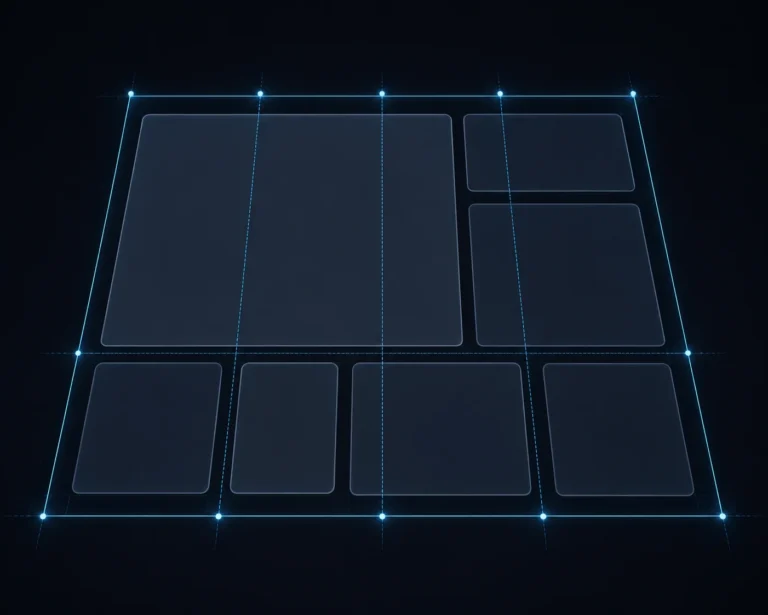
Step-by-Step: How to Create a Bento Grid Layout in Elementor Pro 2026
Step 1: Enable Container and Grid Features
Go to Elementor → Settings → Features in your WordPress dashboard and make sure both Flexbox Container and Grid Container are switched on. In most 2026 installs these are already active by default, but it’s worth confirming before you start, since older sites that haven’t been updated in a while may still be running on legacy Sections.
Step 2: Add a Grid Container to Your Page
Open the page in Elementor and add a new Container. In the Layout tab, switch the Container Type from Flexbox to Grid. Elementor will default to a basic 3×2 layout, which is your starting canvas.
Step 3: Plan Your Grid Structure
This is the step people skip, and it’s the one that determines whether your bento grid looks intentional or accidental. Decide how many columns and rows you actually need. A common, reliable bento structure for a homepage feature section is a 4-column, 2-row grid, where:
- One cell spans 2 columns and 2 rows (your hero tile)
- Two cells span 1 column and 1 row each (supporting tiles)
- One cell spans 2 columns and 1 row (a wide banner-style tile)
Set this under the container’s Layout settings, where you’ll find grid template controls for columns and rows.
Step 4: Assign Column and Row Spans to Each Cell
Here’s where the “bento” effect actually happens. Select the child container or widget sitting inside a specific grid cell, go to its Advanced tab, and look for the grid item controls where you can set Column Span and Row Span. Increasing a tile’s span is what makes it visually dominant compared to its neighbors.
If you’re using plain Elementor without a bento-specific addon, you may need to add a short custom CSS snippet per item (something as simple as grid-column: span 2; grid-row: span 2;) since native span controls vary slightly by Elementor version. Either approach gets you the same visual result.
Step 5: Build Content Inside Each Cell
A grid cell can only hold one element directly, so for anything beyond a single image or heading, nest another container inside the cell first. This lets you stack an icon, heading, short paragraph, and button inside what looks like one clean card. Keep the internal padding consistent across all cells so the grid reads as one cohesive system rather than mismatched boxes.
Step 6: Style Each Cell for the Bento Look
The bento aesthetic depends heavily on styling discipline. A few things that make the difference between a grid that looks premium and one that looks like a spreadsheet:
- Rounded corners — apply the same border-radius across every cell, typically between 16px and 24px
- Consistent gap spacing — set your row and column gap once at the container level so every cell has identical breathing room
- Subtle backgrounds — light gradients, soft shadows, or muted brand-color tints work better than flat white boxes with hard borders
- Hover effects — a gentle scale or shadow-lift on hover adds interactivity without feeling gimmicky
Step 7: Make It Responsive
Switch to tablet and mobile preview inside Elementor and rebuild the grid template for each breakpoint. On mobile, most bento grids should collapse into a single column, with the hero tile appearing first. Elementor lets you set a separate grid-template-columns value per device, so your 4-column desktop layout can become a clean 1-column mobile stack without losing any content.
Step 8: Preview, Test, and Publish
Before publishing, check load speed with your images compressed (WebP is the standard format in 2026), test on an actual phone rather than just Elementor’s preview mode, and confirm the tab order makes sense for keyboard and screen reader accessibility.

When to Use a Dedicated Bento Grid Addon Instead
Native Grid Containers handle most projects fine, but if you’re building bento sections often, or want features like automatic masonry-style packing, per-cell background videos, or ACF/WooCommerce data connections, a dedicated Elementor bento grid widget from an addon library can save significant build time. These plugins handle the column and row span math visually through sliders instead of manual CSS, which is worth it for agencies producing multiple bento layouts a month. For a one-off section, the native container method covered above is usually enough.
Common Mistakes to Avoid
- Too many differently-sized tiles. Stick to two or three size variations max, or the grid loses its sense of hierarchy.
- Inconsistent gaps. Mismatched spacing between cells is the fastest way to make a bento grid look unfinished.
- Ignoring mobile first. Designing only for desktop and hoping mobile “just works” almost always produces a broken stack.
- Overloading a single cell with content. Bento tiles work best with short, punchy content — a headline, a short line, maybe an icon or stat, not a full paragraph.
- Skipping alt text on images. Every image inside your grid cells still needs descriptive alt text for both accessibility and SEO.
Real-World Use Cases for Tier-1 Brands
For established companies and enterprise-level websites, bento grids work particularly well on:
- Homepage “why choose us” sections that need to communicate several trust signals at once without a wall of text
- Case study pages, where a large tile can hold the headline result and smaller tiles show supporting metrics
- Careers pages, mixing culture photos, benefits, and open roles into one scannable block
- Product or service comparison sections where visual weight should reflect business priority, not just alphabetical order
This is exactly the kind of section we design into homepages and landing pages for clients at Dynamic Tech World, since it lets an enterprise brand present a lot of information in a small amount of scroll depth, which matters for both user experience and page speed metrics.
Final Thoughts
A bento grid layout is one of the rare design trends that’s both visually striking and genuinely practical. It gives you a way to prioritize content visually, keep pages compact, and give a WordPress site a design language that feels current rather than templated. With Elementor Pro’s native Grid Container, building one no longer requires custom development, just a bit of planning and attention to spacing.
If you’d rather have this built, tested across devices, and optimized for speed and SEO from day one, our team at Dynamic Tech World designs and develops custom Elementor websites for businesses that want their site to actually perform, not just look good in a screenshot. Get in touch with our team to discuss your project, or explore more build tutorials like this one on our Tutorials page.
Frequently Asked Questions
What is a bento grid in web design?
A bento grid is a layout style made of modular boxes of varying sizes arranged within a single grid, inspired by the compartments of a Japanese bento box. It’s used to create visual hierarchy while displaying multiple pieces of content in a compact, organized way.
Do I need Elementor Pro to build a bento grid, or does the free version work?
The Grid Container feature that makes bento layouts possible is available in both Elementor free and Elementor Pro. Pro adds extra styling, motion effects, and dynamic content controls that make the final result more polished, but a basic bento layout can be built without it.
Is a bento grid the same as a masonry layout?
No. A masonry layout arranges items of varying heights in flowing columns, similar to Pinterest. A bento grid uses fixed, deliberate column and row spans so every tile has an intentional size and position, giving it a more structured, designed appearance.
Will a bento grid slow down my website?
Not if it’s built correctly. Native Elementor Grid Containers output clean CSS Grid code, which is lightweight. The main factor affecting speed is image optimization, so compress and lazy-load images inside your grid cells to keep page speed scores high.
Can a bento grid layout be made fully responsive on mobile?
Yes. Elementor allows you to define a separate grid template for desktop, tablet, and mobile, so a multi-column bento layout can collapse into a clean single-column stack on smaller screens without losing content or hierarchy.
How many columns should a bento grid have?
Most effective bento grids use a 3 to 4 column base structure on desktop. Fewer columns tend to limit how creative you can get with size variation, while more than 4 often makes individual tiles feel cramped.
Written by Abhay Pathak, Founder of Dynamic Tech World, an ISO 9001:2015 certified web development agency based in New Delhi specializing in custom WordPress and Elementor builds.

Abhay Pathak
Founder, Dynamic Tech WorldAs a full-stack web developer and AI orchestration specialist based in New Delhi, I help creators and agencies scale their digital assets through automated systems, high-speed development, and advanced prompt engineering.
Launch Your Site
Claim up to 20% OFF Premium Web Hosting + a FREE Domain. Fast & Secure.
Claim DiscountJoin the VIP Club
Get free Elementor Pro updates, premium AI prompts, and daily tech hacks directly on our Telegram.
Join TelegramWork With Us
Need a high-converting website, custom AI workflow, or want to advertise your brand to our global audience?
Contact Agency